Problem
By default, the graphical output of the FullProf’s Rietveld or Le Bail refinement is saved as a *.pcr file. It is a text file that can be opened with WinPLOTR (included in the FullProf software suite), which is good for viewing and analysing the patterns. It can even be used to export the plot in, e.g., a very rad *.bmp file format, which by default looks like this:
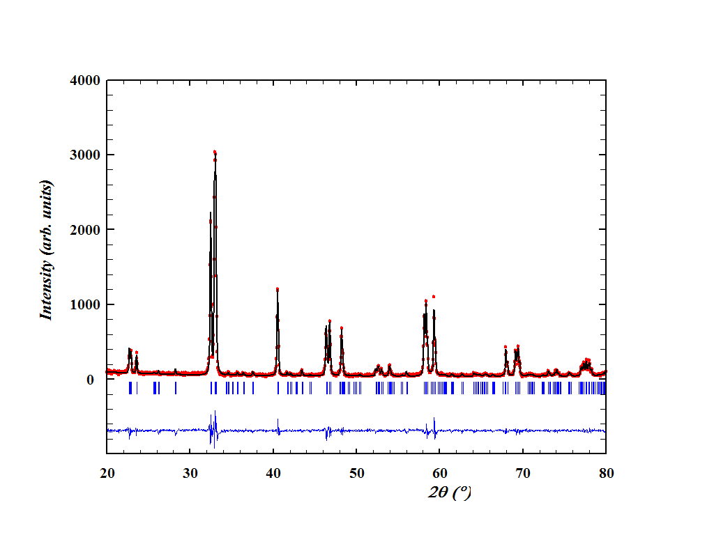
If you like this picture, stop reading this right now.
It is true that this plot can be customized with the WinPLOTR. It is also true that the tab-delimited text contents of the *.pcr file can be imported into some graphic software like the ubiquitous OriginLab’s Origin. However, I don’t like the ticks being too far away from the pattern (it’s not the case in the figure above, but you’ll notice it when the background is high), the difference line being too far away from the ticks, and I don’t enjoy much shifting these things manually and fine-tuning every plot depending on the pattern, the background, and the moon phase.
So here I’m going to share a solution for obtaining the publication-quality figures from the *.pcr files using the script in Python (well, in a jupyter notebook, if you like). The resulting plot will look as follows:
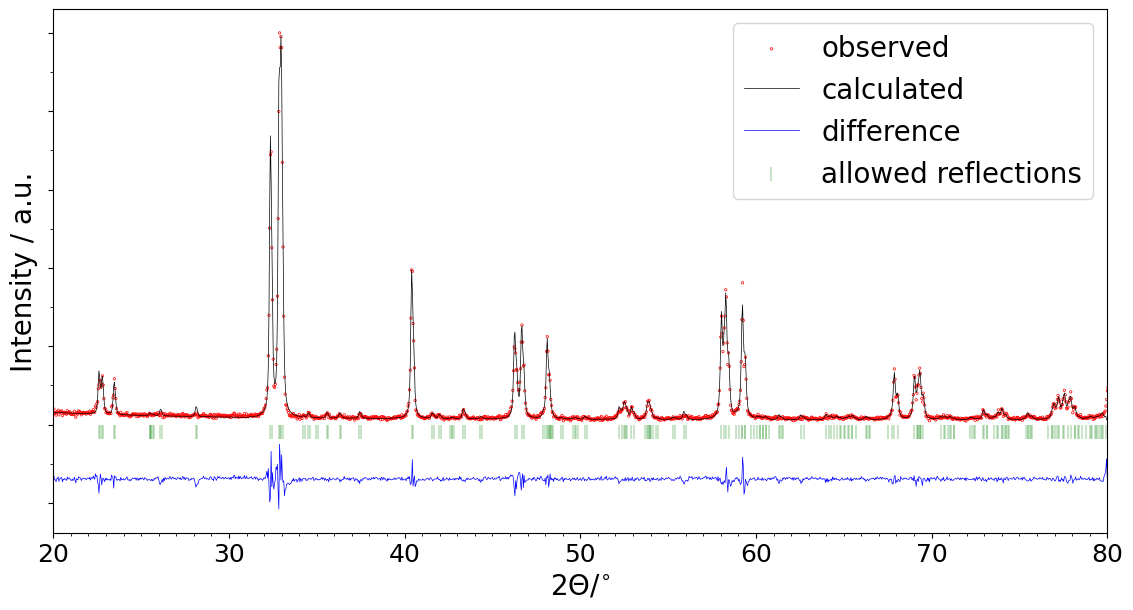
(in fact, even better - this one was made for this post with 100 DPI resolution to save the traffic, and the publication-quality implies 300-600 DPI. The resolution is configured in the script.)
What is more, the script allows making a series of figures. Let’s say you have a number of refined patterns, for each of which you’d like to get a picture. Then you’ll need to select the project folder in the script settings (or upload several *.pcr files at once if the script is executed in Google Colab), run the script, and whoosh - you have several figures to share with your collegues.
Solution
The script is hosted as a github gist:
If you have Python and jupyter lab or notebook installed, go ahead, clone or download, read the brief instructions, modify if needed, and use.
If you do not want, care or know how to use Python on your local machine, you can use Google Colab instead. The script automatically determines the environment it is executed in. Using Google Colab would involve moving the *.pcr and image files between your computer and Google servers, but who cares. The easiest way of importing the script into that thing is by clicking (in Colab, that is) File - Open (Ctrl+O), then the GitHub tab, then pasting the URL to the gist (see above), and, finally, clicking the search button. When the file opens, read the explanation notes, change the settings, then run everything (the shortcut is Ctrl+F9).
Explanation
Basically, all the script does with the data is that it reads the *.pcr, rescales the data therein to percents of the highest peak (so as to not accidentally “compress” the difference line) and moves the lines and ticks closer to each other. The last step involves calculating the automatic background to determine where to place the ticks under the pattern. Then, the plotting happens. As a data artifact, the script produces (provided that save is true in the dataSettings) the tab-delimited text file, containing the following columns:
2theta | Yobs(%) | Ycalc(%) | Difference(%) | 2theta(ticks) | Y(ticks)The pattern example, in case you’re wondering, came from one of our latest articles.